Why Your Paragraphs Feel Cramped
The trouble is almost never the font, and I say that as someone who sells fonts

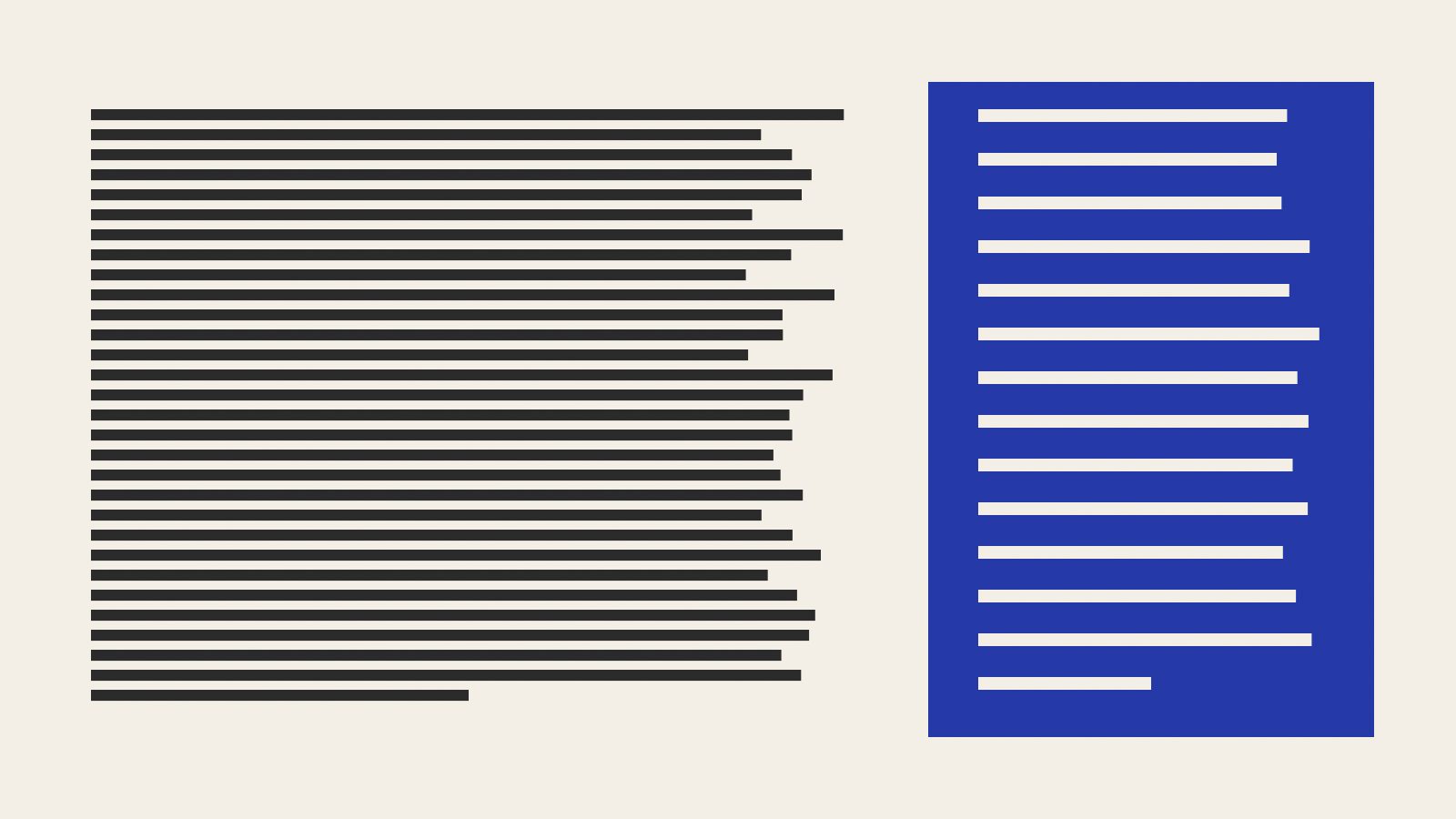
A woman who publishes a seed catalog once offered me four thousand dollars to redraw her body font, and I talked myself out of the money in about ninety seconds.
Her complaint was that the online edition felt cramped. Readers had told her so, and her nephew had told her the font looked dated, so she went looking for someone to modernize the letters. She sent me a link. I opened it on my big monitor and found descriptions of heirloom tomatoes running the full width of the window, about 150 characters to a line, with the lines stacked as tightly as the browser would stack them. There was white space everywhere: a huge band of it at the top, a generous footer, acres of nothing around the photos.
That is the odd part of cramped. A page can be half empty and still feel like an elevator at five o’clock. The complaint has little to do with how much space there is and a great deal to do with which direction it runs.
The measure
Typesetters call the length of a line its measure. The figure handed down through generations of printers is 45 to 75 characters per line, counting spaces, with something near 66 as the comfortable middle for a single column of prose. An older rule of thumb says the same thing in a form you can check by eye: a line should hold about two to three lowercase alphabets, end to end.
None of this is superstition, though printers arrived at it long before anyone tracked an eyeball. Your eyes don’t glide along a line. They hop, seven or eight letters at a go, and take in the text during the pauses. The hard hop is the last one, the long swing back to the left margin, where the eye has to land on the start of the very next line. On a 150-character line that swing is a small feat of navigation with no landmarks. You land on the line you just read, or you skip one, and you correct without quite noticing. Nobody reports this as a problem with the layout. They report being tired, or that the writer goes on a bit.
Too short has its own trouble. Below about 40 characters the eye never settles, phrases get chopped in half, and the right edge turns into a coastline. Newspapers got away with narrow columns for a century by keeping each item brief. Your 3,000-word essay won’t.
The leading
Leading is the distance from one line to the next, named for the actual strips of lead that compositors slid between rows of metal type. A browser left to its own devices gives you roughly 1.2 times the font size, which suits a headline and very few paragraphs. Body text generally wants somewhere from 1.4 to 1.6.
The two settings are married. Leading is the runway for that swing back to the left margin, so a longer line needs more of it, and a font with a tall lowercase needs more than one with a small lowercase, because it has already spent its white space inside the letters. Then there are the descenders. I have drawn more lowercase g’s than is healthy, and I can tell you the two-story kind, with the closed lower bowl and the little ear, is the first thing to crash into the line below. Set tight, every g on the page is sitting in somebody’s lap.
Don’t take my word for any of it. The paragraph below will reset itself at whatever measure and leading you pick.
Go wide first, with the leading tight, and read three lines. You should feel yourself hunting for the next one. Now leave the width alone and open up the leading. Better, but you’re still walking a long way for each line. Then bring the measure in slowly. Somewhere in the sixties, something goes quiet. I have spent my working life trying to sell people that quiet.
What I actually do
For most prose on the web, I start here and adjust by eye:
.story p {
  max-width: 32em;
  line-height: 1.55;
}
You’ll see advice to use 65ch instead, which looks tidier. The ch unit is the width of the font’s zero, and the zero is usually wider than the average lowercase letter, so 65ch tends to deliver quite a few more than 65 characters. Whatever unit you choose, count. I mean really count, with a fingertip on the screen, like a child. On a phone you’ll land around 40 to 45 characters regardless, and there you can ease the leading back toward 1.4, since the eye has hardly any distance to travel.
The seed catalog got two lines of CSS and a bill for one afternoon. Same font, same size, 68 characters a line. Her nephew asked what she planned to put in all that empty space on the sides, and she told him nothing, and he looked at her as if she had left the stove on.
Nobody wrote in to say the catalog looked better. Several people wrote to say the tomato descriptions had gotten funnier, which surprised her, because she hadn’t changed a word.